The Art of Slide Design: Maximise Signal, Minimise Noise
Last weekend I gave a talk at DevRelCon Tokyo called The Art of Slide Design. This is the second post in this series, covering the first principle: maximise signal, minimise noise. The series is pretty much the blog post version of my script/speaker’s notes for it, albeit split out over several posts!
Go back to read The Art of Slide Design intro.

Our first principle is maximise signal, minimise noise.
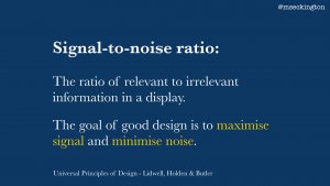
This principle comes from the theory of signal to noise ratio (from Universal Principles of Design). This is the concept that in every type of communication we have there is a certain amount of relevant information to us, the signal, and there’s a certain amount of irrelevant information to us, the noise.
With good designs we want to maximise the signal and minimise the noise, ending up with mainly relevant information rather than irrelevant information.

So how do we maximise signal and minimise noise in our slide designs? How do we make sure that the information on our slides is mainly relevant rather than irrelevant?
I think there are a few things that we can do to achieve this.
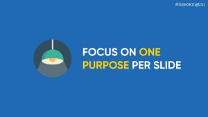
The first is focus on one purpose per slide. This is about maximising the signal.
The moment a slide has multiple purposes it dilutes the relevant information you’re trying to get across. Rather than having a single slide covering multiple ideas or concepts, split them out over several slides. This is about making sure that your slide is as relevant as possible to what you are saying at that point of time.

One thing I see happen a lot is using bullet points on one slide to cover multiple ideas. For instance take this slide about cat facts. If you’re going to be talking for a few minutes about the history of house cats and then a few minutes about why cats sleep 75% of their lives and then a few minutes about each of the other points, you’re basically diluting the signal of each point you’re trying to make.
Cause while you are talking about the history of cats – your audience is reading and thinking about all the other things that are on your slide already and they won’t be listening to you.

It’s much better to spit out those ideas over multiple slides. Allow your audience to focus on the one thing you’re trying to get across, the most relevant information for the audience at that time.
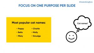
Now I’m not saying you shouldn’t be using bullet points at all, but use them to support the specific purpose of your slide. For instance, in this case the bullet points are used to list a set of names that belong together – all the information together is what makes it relevant.
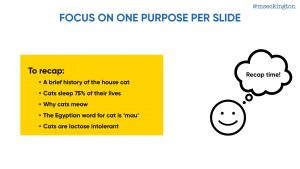
Another exception is when you’re using it to recap or give an overview of all the things you’ve said earlier. This slide has the same content as we saw before, but in this scenario, you’ve covered each of points separately already. The purpose is to show stuff you’ve covered before in one single slide – the audience doesn’t have to focus as much on the individual points cause none of it is new information – they’ve each been dealt with separately already.
So context matters a lot.

The second thing we want to do is make sure our slides aren’t distracting. In this case we’re trying to minimise noise – ensuring we don’t have any irrelevant information.
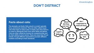
One way of being distracting is having way too much text on your slide. The moment you have a slide like this, people stop listening to you. Cause they’re either distracted by trying to read all the stuff that’s on there, or they get distracted trying to read and listen at the same time.
Rather than allowing your audience to focus on what you’re saying, by having that much text, you’re basically kicking off all these different questions and thoughts.
Think about what information really matters and distill it down to just the very essential.
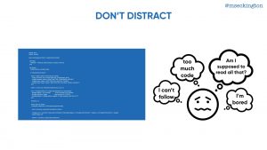
A variation of this is having too much code on a slide.
Most of the time you really don’t need all of it. Instead focus on the part that actually matters to the audience at that time – don’t force them to try to read all of that, cause you’re only creating a situation for people to zone out and not listen to you.

Another way slides can be distracting is when there’s just too much going on in them.
This is an extreme example, but I often feel that people want to use all the space they can on a slide, making things super busy and much harder to process.

Keep your slides simple and clean, so that they’re not visually distracting.
This shows exactly the same images as before, but because they’re not overlapping and because there’s no text laid over it, it’s easier for the audience to process.
To recap: you can maximise signal by focusing on one purpose per slide and you can minimise noise by reducing distractions on your slide.
Continue on to read about our second principle: Make Important Information Stand Out!
Want to hear when the next post goes live? Follow me on Twitter: mseckington.
Enjoyed this post and want more? You might like: Employee Evangelism: Make Your Team Badass, Blogging tips: How to start writing , How I got into conference speaking and Imposter Syndrome: How we act and work together.