The Art of Slide Design: Make Important Information Stand Out
Last weekend I gave a talk at DevRelCon Tokyo called The Art of Slide Design. This is the third post in this series, covering the second principle: make important information stand out. The series is pretty much the blog post version of my script/speaker’s notes for it, albeit split out over several posts!
Go back to read The Art of Slide Design intro and Maximise Signal, Minimise Noise.

Our second principle is: make important information stand out.
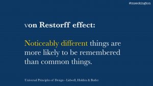
So again let’s go back to some theory (from Universal Principles of Design). The von Restorff effect is a phenomenon where you’re more likely to remember things that are noticeably different than things that are common. This is about making things look more unique or distinctive, so that it stands out more and that people will remember them.
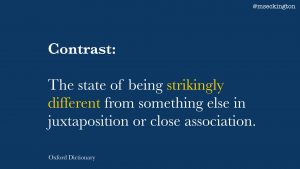
This is basically what the definition of contrast is: the state of being strikingly different from something else in juxtaposition or close association. So what we want is to use contrast in our slides to make things memorable.

A good example of using contrast comes from this book, Slide:ology, from Nancy Duarte – which is all about how to make good presentations.
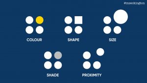
In it she explains contrast through this visualization, highlighting how we can use contrast in our slides in a couple of different ways – using colour, shape, size, shade and proximity. In each of these examples, you’re automatically drawn to the element that stands out.
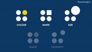
I’ll only cover three of these here, cause I think shade is a variation of colour and proximity isn’t as easy to apply as the others.
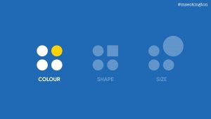
I’ll give examples for each of these 3 areas, starting with colour.
First step is choose a colour palette with contrasting colours.
In the case of colour, contrasting doesn’t necessarily have to mean exact opposite – it’s more about having colours that work well together and are different enough from each other that you can see that they are noticeably different. I won’t go into too much detail here about colour theory, cause there are plenty of web sites and books out there that cover this.

One of those websites I really like though is colorsupplyyy.com. It allows you to quickly try out various colour combinations and shows different variations of it.
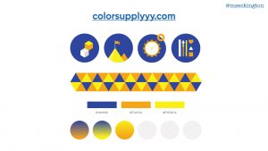
Plus it also shows you how the colours look together in icons and patterns. So you can get a sense of what type of contrast you might be able to get in your slides.
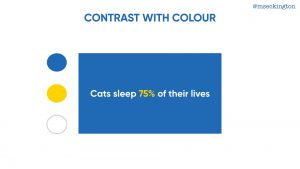
One way of using colour contrast is to use it within a slide to highlight the most important phrase or data.
Going a bit meta, you’ll have noticed that most of my own slides in this presentation have been following exactly this pattern.
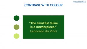
Another way of using colour is to highlighting different elements on your slide. As I mentioned before the colours don’t need to be too opposite each other – you can use the same colour, in this case: green, and achieve contrast from the different variations of green.
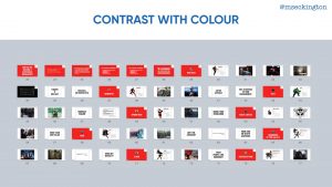
Besides using contrast within slides, you can also look at contrast between slides. If you use Keynote, this is the Light Table view – where you can see an overview of all of your slides. I use this overview a lot, cause you can quickly see how all your slides feel as a whole.
This is an overview of one of my presentations from last year about lessons that we could learn from Marvel superheroes.
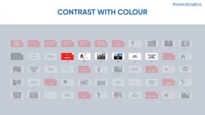
I each time used a red slide at the start of a section to highlight that we were switching to a different superhero.
Because all the other slides are white, the red title slide stands out much more and makes people pay attention.
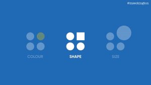
Second way to use contrast is shape. Now traditionally when you think of shapes, you think of shapes like in that example: circles, squares, triangles, etc. And while they can be used within your slides for contrast, those aren’t actually the shapes that we most rely on in our presentations
What we rely on a lot are fonts. So one way of achieving contrast is through using different types of fonts within your presentation.
I tend to use custom fonts cause the fonts that are built in to our systems are mostly designed for reading paragraphs of text, so they don’t quite work when on a slide, and also people are more familiar with them already and it won’t stand out as much as it could.
Which fonts you end up choosing is quite a personal choice, and it will depend on your presentation style what type of feeling you want your slides to exhibit.
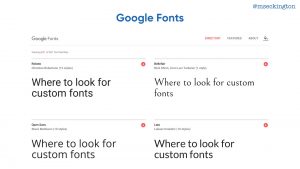
If you don’t want to spend anything, the first place to look for free fonts is Google Fonts.
The main focus of the collection is in providing the fonts as web fonts, but you can download them too and use them in most slide editors.

If you’re willing to pay for fonts, I’d suggest taking a look at the bundles on these websites (Design Cuts, Pixel Buddha, DreamBundles, The Hungry JPEG). Rather than buying a single font, you basically buy a bundle of different fonts and they often include quite a large and interesting selection.
Once you have multiple fonts, you can start playing around with them to create contrast. I’ll show a couple of examples, but again this is by no means the only ways you can create contrast.
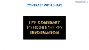
In this first example we are using different fonts within the same phrase or sentence – the contrast is used to highlight specific words.

The second way is using different fonts for different elements on the slide.
It’s about making it easy for the audience to understand the different purposes of those elements.
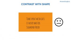
Cause if it was all in the same text, it just makes it way too confusing to read and comprehend.
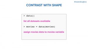
The same is true for when you’re displaying code – if you’ve got multiple elements on your slide with different purposes, use contrast to show that they are different.
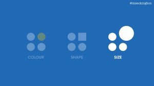
Third way to use contrast: size.

The simplest way of using size for contrast is just grabbing a single element and making it bigger – using it to make a statement about something.
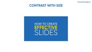
Or you can play around and make each part of the sentence a different slide. Again you’ll have noticed I tend to use this a lot within my own slides.

What becomes interesting though is when you start pairing different fonts with different sizes – it means that you can really play around with making a slide look quite graphic.
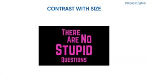
These type of slides will stand out more and make it more compelling to people. In these cases the contrast is both within the slide and outside of the slide, making the slide more memorable.
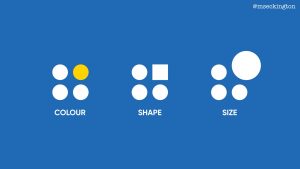
So those are 3 ways that you can use contrast to highlight key information and make it more memorable for your audience.
Through colour, shape and size.
Two down, two to go. Continue on to read about our third principle: Show AND Tell!
Want to hear when the next post goes live? Follow me on Twitter: mseckington.
Enjoyed this post and want more? You might like: Employee Evangelism: Make Your Team Badass, Blogging tips: How to start writing , How I got into conference speaking and Imposter Syndrome: How we act and work together.
