The Art of Slide Design
Last weekend I gave a talk at DevRelCon Tokyo called The Art of Slide Design. This is pretty much the blog post version of my script/speaker’s notes for it, albeit split out over several posts!
I’ll be publishing the posts over the next couple of days, starting today with the intro (this post) and the first principle Maximise Signal, Minimise Noise.
I’m also planning on doing some followup posts to go into more detail about some of the topics (like choosing custom fonts and creating animations). For now though, this is staying pretty true to the original talk. Check out the full slides on SpeakerDeck.
As I’ve mentioned before on this blog, for most of my life I hated giving presentations – as a kid, as a teen, as a university student. I was so scared and nervous in front of people that I tried to avoid giving them as much as I could. Whenever I did have to do one, I’d be a bunch of nerves for the entire week before, and often because of my nerves the presentation wouldn’t turn out that great. I didn’t believe it was something I’d ever be able to do well and I really didn’t believe it was something I’d ever enjoy.
Nowadays I actually like giving presentations. For the past 3 years, I’ve been giving talks at meetups and conferences, and part of my role at FutureLearn is to encourage my team to both blog and speak more (read more about that in my post about employee evangelism).
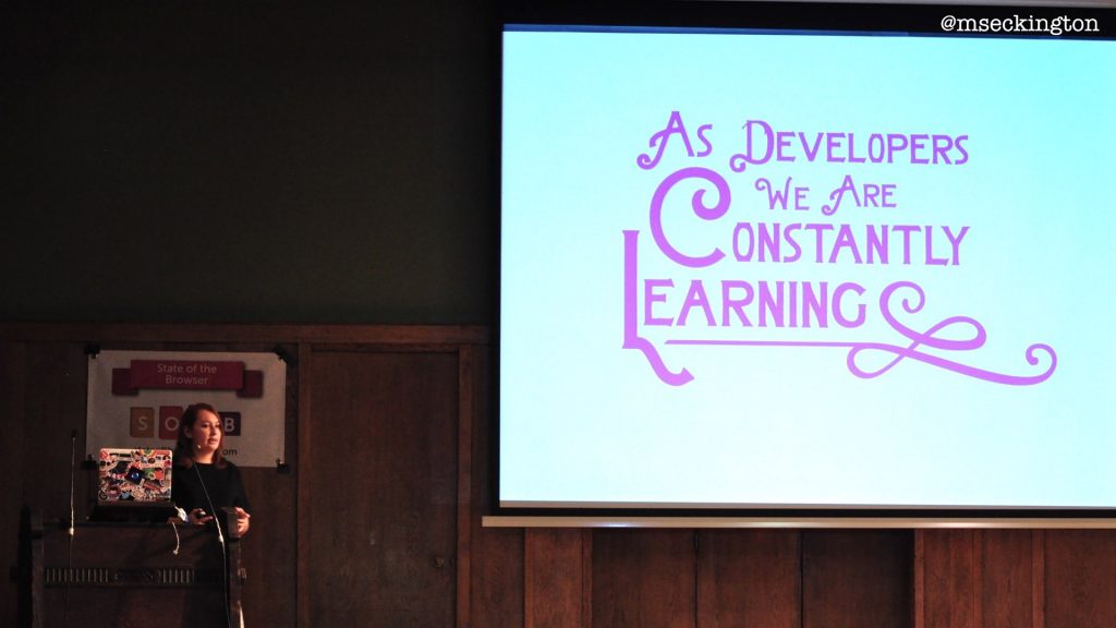
For me, the secret, the magical solution, came from preparation.
I find that whenever I try to learn something new, it becomes easier for me if I understand all the different aspects, all the different building blocks of what it is that I’m to learn. With presentations it was about understanding my emotions and how my face and body and voice were reacting when I got nervous. It was about understanding how to tell compelling stories and how to keep the audience engaged. It was about discovering how often I need to practice until I feel completely comfortable with what I’m going to say. And it’s about understanding how to use the tools I have in the most effective way.
Alongside our voice and our words, our slides are the most important instrument in our presenter’s toolbox. And we should learn to use them as effectively as we can.
Nowadays after most of my talks, I’ll often get compliments that people really liked my slides, sometimes with the sly additional question whether I got someone else to create them (nope, just me). Just like mastering other skills, once you know some of the tricks, it does get easier the more you do it.
So that’s what this series of blog posts are about: how to create effective slides.
But what does that mean? What makes your slides effective?
Let’s take a step back and look at why we are presenting in the first place: what’s the goal of a presentation? At first glance you might think each presentation is different: some will be about teaching a new skill or knowledge, some will be to convince people to use a specific product, some will be to inspire and motivate people to change or do something.
There are endless goals of what a presentation is for and no two presentations will be the same.
Yet at the heart of it, they all have one thing in common: no matter what your motivation behind the presentation is, your #1 goal as a presenter is to allow your audience to absorb your information. Whether you’re trying to teach, convince, motivate, frighten, sell, inspire – it’s your responsibility to make that easier for your audience.
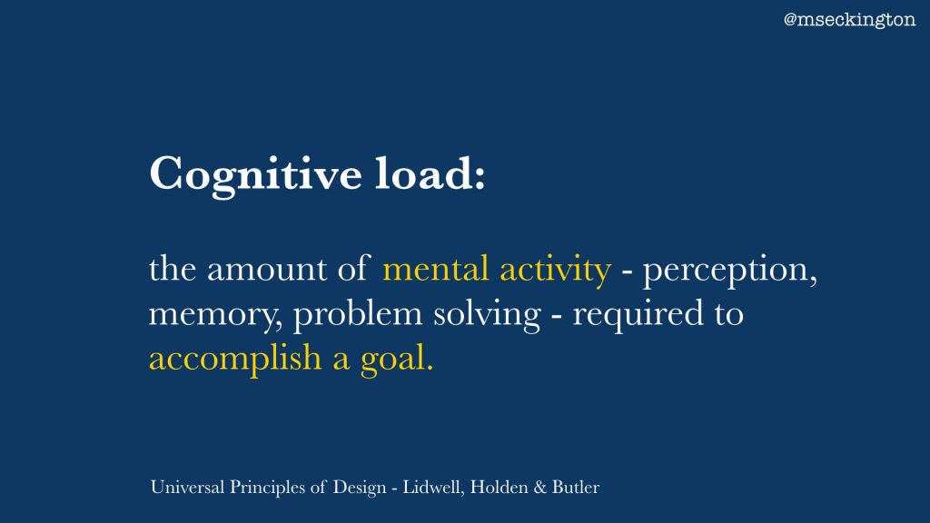
This all ties in with the concept of cognitive load: the amount of mental activity – perception, memory, problem solving – required to accomplish a goal.
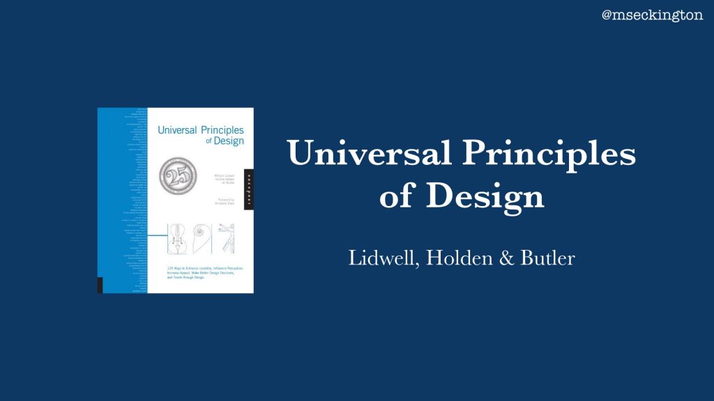
This definition comes from the book: Universal Principles of Design and I’ll be referring to it a couple of times throughout these blog posts. It’s a great resource book covering 125 design principles and ties it back to psychology and physiology research.
In that book we also find this quote about cognitive load: design should minimise cognitive load to the greatest degree possible.
So when we talk about effective slides, we mean slides that help reduce that cognitive load.

Slides that help rather than prevent people from consuming your information.
So how do you create effective slides? How do you create slides that are compelling and help your audience?
The answer lies in shifting that question to: how do you design effective slides? We can get a better understanding of slide design, by looking at design theory.
In the next few posts, I want to share 4 principles of slide design, so that you can create more compelling slides and help your audience absorb the information you’re presenting.
One thing to bear in mind here is that I don’t believe there is “one true way” of creating slides. This isn’t about getting you all to create the same type of slides that I do – rather it’s helping you get a basic understanding of design theory and applying it to your own style.
If you’re starting out, don’t feel like you have to attempt changing all of your slides in one go: choose one principle to apply to your next presentation and build from there. Hopefully you’ll be able to hit the ground running with some of the tips in these post and make your slides a little bit more unique and effective.
Let’s start with the first principle: Maximise Signal, Minimise Noise.
Enjoyed this post and want more? Follow me on Twitter: mseckington. You might also like: Employee Evangelism: Make Your Team Badass, Blogging tips: How to start writing , How I got into conference speaking and Imposter Syndrome: How we act and work together.
