If you follow me on either Twitter or Instagram, you’ll have seen that since last week I’ve started celebrating my birthday!

I realized last year that I don’t really enjoy just having 1 party where I have to interact with a ton of people who I all barely get to talk to. So instead I’m celebrating my birthday for a month long, doing a ton of different stuff: dinners, cocktails, escape rooms, theatre and movies. It takes a lot of planning, but it means I get to a lot of things that I wanted to and I get to hang out and catchup with smaller groups of friends.

Besides that though, today is also my 11 year blog anniversary! Technically it’s not MissGeeky.com’s birthday, but it’s the day I started blogging (and all the posts from that original blogged were moved to MissGeeky when I started that). So it really is #missgeekysbirthdaymonth for me!

To celebrate this birthday month, I’ll be doing a massive giveaway of 11 of my favourite things!

Update: This giveaway is now closed!

That’s it! In total I’ll be giving away 11 different things – and select the 11 winners at random.

The giveaway ends on Friday March 2nd 17:00, and I’ll randomly draw the winners of each of the prizes then. Sadly I do need to keep this to UK only, cause of the shipping costs. Keep in mind though some of these prizes do only make sense if you’re based in London, so you do need to be able to travel here on your own costs if you win any of those.

Here are all the things I’ll be giving away:

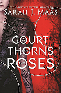
A Court of Thorns and Roses from Sarah J Maas: the first part of my favourite series from last year. It starts off as a faerie retelling of Beauty and the Beast, but as the series continues it evolves into so much more. I think the first one is the weakest chapter of all three, but you need to start there!

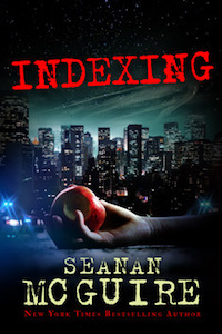
Indexing from Seanan McGuire: What if fairy tales narratives are dangerous and can impose themselves on the world? This book is about the ATI Management Bureau, an organization that protects the world from fairy tales taking over.

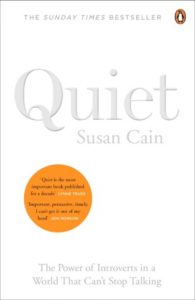
Quiet from Susan Cain: I’ve always considered myself a massive introvert and have blogged in the past about what it means to be a social introvert. I wish I had read Susan Cain’s Quiet much earlier, cause she really explains the differences between introverts and extroverts, and shows the way our society is built around extroversion.

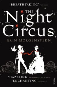
The Night Circus from Erin Morgenstern: The Night Circus describes a place that feels plucked from my dreams, the circus I never knew I wanted to visit. There’s just something about the circus itself that feels part escape room and part immersive theatre, and I ended up wishing it was a real place that I could actually go to. I absolutely loved this book.

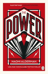
The Power from Naomi Alderman: Fascinating look at what would happen to our world if women suddenly developed the power to electrocute people. How would society change?

Ready Player One from Ernest Cline: I sped through this book when I picked it up. I’m planning on rereading it before the movie comes out next month!

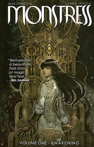
Monstress: Volume 1 from Marjorie Liu and Sana Takeda: this comic is so good! It’s set in an alternate matriarchal 1900’s Asia and the artwork and story are both amazing.

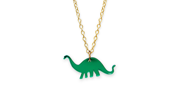
Apatosaurus Necklace from Little Moose: Isn’t that necklace adorable? I’ve got several from Little Moose and I love how quirky their designs are.

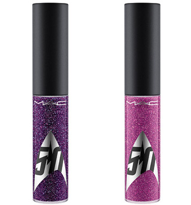
Star Trek Lip Gloss from MAC (Khaaannnn! and Warp Speed Ahead): These are limited edition lip glosses which have been discontinued! They’re both super glittery and pretty.

Prince Charles Cinema Annual Membership: I love the Prince Charles Cinema. This gives you discounted tickets to their regular screenings, £1 tickets for weekly member screenings and discounts at local stores and restaurants (including Forbidden Planet and Shoryu).

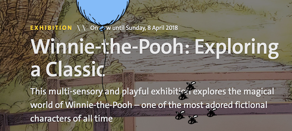
2 tickets to Winnie-the-Pooh: Exploring a Classic at the V&A: I haven’t been myself yet, but I’ve always been impressed by the exhibitions at the V&A. This one will tell the story behind the creative partnership of A.A. Milne and E.H. Shepard!

And that’s it! 11 things for an awesome 11 years. Thanks to all my regular readers for sticking with me for 11 years!

Update:

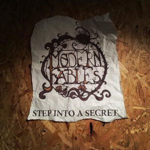
Thanks to the brilliant team at Modern Fables, I’ve added a 12th prize to the giveaway: a voucher for a free game of The Escapist for 2-6 people! I did this escape room a few days ago and it was a lot of fun – it’s slightly spooky with a good narrative and puzzles!

Tags: Geeky

A few months back I gave a talk at DevRelCon Tokyo called The Art of Slide Design. This is the fifth post in this series, covering the final principle: be consistent. The series is pretty much the blog post version of my script/speaker’s notes for it, albeit split out over several posts!

Go back to read The Art of Slide Design intro, Maximise Signal, Minimise Noise, Make Important Information Stand Out and Show AND Tell.

The final principle is Be Consistent. When we hear consistent, I think some people interpret that as let’s make everything look the same. “I’ll use the same background and the same font for every single slide.” That’s not what I mean here.

In design, consistency is defined like this: the usability of a system is improved when similar parts are expressed in similar ways. So when we’re talking about consistency in slide design, it’s about making sure that those slides that are similar look and feel the same way. I think slides are similar if they have a similar purpose.

Bit of a mouthful, but: use consistent designs for slides with the same purpose

So this is all about identifying your slide patterns: what are the types of slides within your presentation that you keep using over and over again? Once you know what types of slides you have, you can make sure they follow the same patterns.

I’ll use the images in these blog posts as an example, cause by now you’ve been exposed to some of these patterns.

To start this presentation had the heading slides: bright and yellow to stand out.

We then had our design theory slides: dark blue background with a serif font in white and highlight words in yellow.

The example sides: a white background with a centred image and a light blue heading.

And then all the other slides: which followed the basic design of white and yellow text on a light blue background.

With some variations.

Having these building blocks means that your audience has reference points. They become easier to process, even though it might happen subconsciously.

The handy thing of breaking it down like this means that for future presentations you have much more tangible building blocks to use. And as you do more and more presentations you end up building up your own library of patterns that you can reuse, and it becomes easier and quicker to put slides together.

So identify your slide patterns: what are the types of slides that are in your presentations?

Those are 4 principles of slide design.

To recap: Maximise Signal, Minimise Noise, Make Important Information Stand Out, Show AND Tell and Be Consistent.

I hope that by applying these you’ll make it easier for your audience to consume the information that you’re presenting and create more effective and beautiful presentations.

If you had told me 10 years ago that nowadays I would regularly be giving presentations and enjoying it, I wouldn’t have believed you.

At the time I assumed that to give a good presentation I would need to focus a lot on me. Making sure that what I say is good and correct. Making sure that I don’t make a fool of myself. Making sure that I don’t eh and uhm.

In reality though, the “me” part of it isn’t that important.

Good presentations are all about the audience – it’s your job as a presenter to make sure that you teach, inspire and motivate your audience.

I’ll be sharing more tips and tricks on creating slides and public speaking in the upcoming weeks. Want to hear when the next post goes live? Follow me on Twitter: @mseckington or sign up to my newsletter.

Enjoyed this post and want more? You might like: Employee Evangelism: Make Your Team Badass, Blogging tips: How to start writing , How I got into conference speaking and Imposter Syndrome: How we act and work together.

Tags: Geeky

A few months back I gave a talk at DevRelCon Tokyo called The Art of Slide Design. This is the fourth post in this series, covering the third principle: show AND tell. The series is pretty much the blog post version of my script/speaker’s notes for it, albeit split out over several posts!

Go back to read The Art of Slide Design intro, Maximise Signal, Minimise Noise and Make Important Information Stand Out.

Note: I kept putting off writing this part of the series, cause I got stuck trying to figure out how gifs work for the section about animation. Instead of putting off for even longer, I’ve decided to at least publish the post, but without the animated gifs – I’ll try to add those in at a later date!

Art of Slide Design.059

Our third principle is: show AND tell.

Art of Slide Design.060

This principle comes from the picture superiority effect, which states that information recall is better when combining text and images.

Art of Slide Design.061

So rather than relying on purely text alone, we should be using visuals to support what we are saying. People remember things better if they’re absorbing that info both in text and in a visual way.

Art of Slide Design.062

I want to talk about 4 ways of adding visuals to your presentations.

Art of Slide Design.063

First: photos. Photos are the easiest way of adding visuals to your slides – making them more lively and memorable. The thing with photos and actually also with gifs is that they do need to be relevant to what you are saying.

So keep Principle 1 in mind: maximise signal, minimise noise. The moment that photos aren’t relevant or if the connection is too tenuous, the photo only becomes noise.

Art of Slide Design.064

The main place I still go for my photos is Flickr, specifically their creative commons search.

It means that you can easily search for images with specific licences – making it easier to know whether or not you can use them.

Art of Slide Design.065

The other place I go is Pexels. They have a huge collection of free to use stock images. While they can be quite pretty, again the main thing to keep in mind here is make sure they’re relevant. If they’re not, it’s better to use an abstract background or just a solid colour. Don’t use photos for the sake of using photos.

Art of Slide Design.066

I mentioned these design bundles earlier already, but again these are great resources for finding images as well.

Art of Slide Design.067

The easiest way to use photos is to use them to completely fill up the slide – and then pair it in some way with text over it.

Art of Slide Design.068

Just to compare: you can see if you use the smaller image, it just doesn’t have as much as an emotional impact.

The image actually makes it more distracting.

Art of Slide Design.069

By using the image as the background, you’re driving the point home much much more. And if you use the right image, the audience will have a much more visceral reaction.

Art of Slide Design.070

Play around and experiment with different photos and different fonts

Art of Slide Design.071

Cause changing either can make a slide feel quite different.

Art of Slide Design.073

Keep in mind not every photo will work as a background – even though this is an adorable photo of a kitten, you can’t really read the text easily.

Art of Slide Design.074

If you really want to use that photo, look at using masks to turn the photo into a specific shape or size.

Art of Slide Design.075

It makes the image just standout slightly more and less like you’ve just plunked the photo into your presentation.

Art of Slide Design.076

Next: icons.

Art of Slide Design.077

The easiest resource for icons is The Noun Project. This website features a ton of royalty free icons of all different topics, and you’re bound to find icons in there that you can use for your slides.

Art of Slide Design.078

Again I’m mentioning design bundles, just cause that’s where most of my icons from this presentation are from.

Art of Slide Design.079

Icons work as nice little highlights to cement the text you’re already showing. It’s a lot less distracting than photos, but it’s enough of a memory cue that it will help people recall information.

Art of Slide Design.080

The third way of adding visuals is using shapes.

Art of Slide Design.081

With shapes, I mean use the shapes that are built in your editor – you can make lines, triangles, circles, squares. You can achieve quite a lot when you start combining them to create interesting visuals for your slides.

At this point I should mention that if you use Keynote, it’s worth installing Keynude. Most of the other themes that are built into Keynote have a lot of default settings that are pretty rubbish – stuff like drop shadows around shapes, gradient fills, I always end up losing some time removing those. Keynude pretty much solves this: it’s a simple stripped-back template with grey shapes, flat charts and just a single empty layout slide. If you’re going to be using shapes a lot, Keynude will save you a lot of time.

Art of Slide Design.082

One example is to create simple pie charts or other types of graphs – it makes the stat just jump out a bit more.

Art of Slide Design.083

Looking behind the scenes this is built up from 2 elements parts: a circle with a square on top of it, that has the same colour as the background.

Art of Slide Design.084

Once you get the hang of shapes you can start constructing more interesting slides – building diagrams that are much clearer than relying on text alone.

Art of Slide Design.085

For instance, this is much more visceral and memorable…

Art of Slide Design.086

… than just having a plain list.

Art of Slide Design.087

Finally if you combine shapes with fonts and photos, you can really start making your slides look more unique and give them some personality.

Art of Slide Design.088

Final way to add visuals: animations.

Before showing some examples, I need to remind you not to misuse them. Most presentation editors support a lot of different animations, and quite frankly most of them are super distracting.

If you use animations, try to make sure the animation you’re using makes sense for the purpose of the slide. If it is distracting, make sure the benefits of using it outweigh the downsides.

I mainly like to use animations if there already is a lot of elements vying for attention on a slide. In this case we already have colour being used, and it isn’t practical to use a different font or a different size to highlight the different elements. So a simple pop animation to grab the attention can work quite well here.

Another way is using animation to reveal elements one by one: it makes it stand out just that bit more, so that people remember it.

Art of Slide Design.090

One of the most powerful animations within Keynote is Magic Move.

You basically grab an element – this can be a shape, a font, a photo. Than copy it to the next slide, but changed. So in a different position, or a different size. Keynote will then automatically figure out what your animation should be. You can use Magic Move to very quickly move things around and give some movement to them.

Use animations in places where by using them you’re making it easier for the audience to grasp some idea or concept. For instance in time lines. You’re using the movement to create this illusion of a time line, making it easier for your audience to understand.

Art of Slide Design.095

So those are 4 ways you can add visuals to your slides. Using both text and images means that your audience will be able to grasp your ideas and concepts much quicker and remember them more.

Three down, one to go. Head on over to read about the fourth principle: Be consistent!

I’ll be sharing more tips and tricks on creating slides in the upcoming weeks. Want to hear when the next post goes live? Follow me on Twitter: mseckington or sign up to my newsletter.

Enjoyed this post and want more? You might like: Employee Evangelism: Make Your Team Badass, Blogging tips: How to start writing , How I got into conference speaking and Imposter Syndrome: How we act and work together.

Tags: Geeky