Two weeks ago I went to The Silhouette in The Smoke, an immersive Victorian drama and murder mystery, set at the London Museum of Water & Steam. I won’t spoil anything about the actual story (other than what’s on the website already), but I wanted to write a bit about the unique format of the evening. And hopefully encourage you all to go see it!

The production is created by the immersive theatre company ImmerCity. They specialize in telling immersive stories, inspired by their unique venues and set in the time period of the venue. I’ve been meaning to make it along to one of their events for a while, cause I had heard great things about their previous shows.

I’m so glad I did! The show is brilliant – I really loved the immersive side of it and everything worked really well together. Being able to walk around the old pumping station really adds to the atmosphere of the entire experience. To set the scene, here’s the description from the website:

“It was 1871, and every level of the pumping station was bustling with activity in preparation for the grand opening of the 100” Cornish Engine, when two unexpected guests from the workhouse arrived demanding to see the small boy who had been apprenticed to the Chief Engineer.

Now, more than a century later, a child’s crying has been heard from beneath the Cornish Engine and it is starting to unnerve the tourists. The Museum has invited the master of the supernatural, Jack Daw, to awaken the past and uncover the truth.”

In a group of 6, you need to solve the mystery of what happened to the boy. We were with the 4 of us, so we got paired with a group of 2 (who were awesome cause they had done more immersive theatre themselves in the past). If you can, try to get a group of 6 together, cause I think it can be more fun if you have a group you know.

In the first half of the play each of your team members gets assigned a different character in the story – using lanterns you follow your character around the old pumping station, watching as part of the story unfolds for you.

After the first half you get back together with the other members of the team, and you get some time to compare notes and tell each other what happened to your character. You then get to interrogate each character for 5 minutes, all whilst trying to figure out Whodunnit. In the end our group figured out the majority of the mystery, and were pretty pleased with ourselves that we did.

I loved this format! I’ve been to some immersive theatre shows in the past where I was slightly uncomfortable with the interactions – I don’t do well with improvising what to say myself and often aren’t sure what the actors are expecting of me. In The Silhouette in The Smoke it felt quite contained and you could prepare in your group what you were going to ask each character. Plus it was fun trying to figure out how to approach each character and what you needed to find out to solve the mystery.

They’re doing 2 more dates in March (on the 28th & 29th) and I can highly recommend you go! I’d love to see what ImmerCity’s next production is. Plus this has inspired me to actually check out the museum properly at some point!

Where: The London Museum of Water & Steam
When: March 28th & 29th
Tickets: £28 per person

If you follow me on either Twitter or Instagram, you’ll have seen that since last week I’ve started celebrating my birthday!

I realized last year that I don’t really enjoy just having 1 party where I have to interact with a ton of people who I all barely get to talk to. So instead I’m celebrating my birthday for a month long, doing a ton of different stuff: dinners, cocktails, escape rooms, theatre and movies. It takes a lot of planning, but it means I get to a lot of things that I wanted to and I get to hang out and catchup with smaller groups of friends.

Besides that though, today is also my 11 year blog anniversary! Technically it’s not MissGeeky.com’s birthday, but it’s the day I started blogging (and all the posts from that original blogged were moved to MissGeeky when I started that). So it really is #missgeekysbirthdaymonth for me!

To celebrate this birthday month, I’ll be doing a massive giveaway of 11 of my favourite things!

Update: This giveaway is now closed!

That’s it! In total I’ll be giving away 11 different things – and select the 11 winners at random.

The giveaway ends on Friday March 2nd 17:00, and I’ll randomly draw the winners of each of the prizes then. Sadly I do need to keep this to UK only, cause of the shipping costs. Keep in mind though some of these prizes do only make sense if you’re based in London, so you do need to be able to travel here on your own costs if you win any of those.

Here are all the things I’ll be giving away:

A Court of Thorns and Roses from Sarah J Maas: the first part of my favourite series from last year. It starts off as a faerie retelling of Beauty and the Beast, but as the series continues it evolves into so much more. I think the first one is the weakest chapter of all three, but you need to start there!

Indexing from Seanan McGuire: What if fairy tales narratives are dangerous and can impose themselves on the world? This book is about the ATI Management Bureau, an organization that protects the world from fairy tales taking over.

Quiet from Susan Cain: I’ve always considered myself a massive introvert and have blogged in the past about what it means to be a social introvert. I wish I had read Susan Cain’s Quiet much earlier, cause she really explains the differences between introverts and extroverts, and shows the way our society is built around extroversion.

The Night Circus from Erin Morgenstern: The Night Circus describes a place that feels plucked from my dreams, the circus I never knew I wanted to visit. There’s just something about the circus itself that feels part escape room and part immersive theatre, and I ended up wishing it was a real place that I could actually go to. I absolutely loved this book.

The Power from Naomi Alderman: Fascinating look at what would happen to our world if women suddenly developed the power to electrocute people. How would society change?

Ready Player One from Ernest Cline: I sped through this book when I picked it up. I’m planning on rereading it before the movie comes out next month!

Monstress: Volume 1 from Marjorie Liu and Sana Takeda: this comic is so good! It’s set in an alternate matriarchal 1900’s Asia and the artwork and story are both amazing.

Apatosaurus Necklace from Little Moose: Isn’t that necklace adorable? I’ve got several from Little Moose and I love how quirky their designs are.

Star Trek Lip Gloss from MAC (Khaaannnn! and Warp Speed Ahead): These are limited edition lip glosses which have been discontinued! They’re both super glittery and pretty.

Prince Charles Cinema Annual Membership: I love the Prince Charles Cinema. This gives you discounted tickets to their regular screenings, £1 tickets for weekly member screenings and discounts at local stores and restaurants (including Forbidden Planet and Shoryu).

2 tickets to Winnie-the-Pooh: Exploring a Classic at the V&A: I haven’t been myself yet, but I’ve always been impressed by the exhibitions at the V&A. This one will tell the story behind the creative partnership of A.A. Milne and E.H. Shepard!

And that’s it! 11 things for an awesome 11 years. Thanks to all my regular readers for sticking with me for 11 years!

Update:

Thanks to the brilliant team at Modern Fables, I’ve added a 12th prize to the giveaway: a voucher for a free game of The Escapist for 2-6 people! I did this escape room a few days ago and it was a lot of fun – it’s slightly spooky with a good narrative and puzzles!

Tags: Geeky

A few months back I gave a talk at DevRelCon Tokyo called The Art of Slide Design. This is the fifth post in this series, covering the final principle: be consistent. The series is pretty much the blog post version of my script/speaker’s notes for it, albeit split out over several posts!

Go back to read The Art of Slide Design intro, Maximise Signal, Minimise Noise, Make Important Information Stand Out and Show AND Tell.

The final principle is Be Consistent. When we hear consistent, I think some people interpret that as let’s make everything look the same. “I’ll use the same background and the same font for every single slide.” That’s not what I mean here.

In design, consistency is defined like this: the usability of a system is improved when similar parts are expressed in similar ways. So when we’re talking about consistency in slide design, it’s about making sure that those slides that are similar look and feel the same way. I think slides are similar if they have a similar purpose.

Bit of a mouthful, but: use consistent designs for slides with the same purpose

So this is all about identifying your slide patterns: what are the types of slides within your presentation that you keep using over and over again? Once you know what types of slides you have, you can make sure they follow the same patterns.

I’ll use the images in these blog posts as an example, cause by now you’ve been exposed to some of these patterns.

To start this presentation had the heading slides: bright and yellow to stand out.

We then had our design theory slides: dark blue background with a serif font in white and highlight words in yellow.

The example sides: a white background with a centred image and a light blue heading.

And then all the other slides: which followed the basic design of white and yellow text on a light blue background.

With some variations.

Having these building blocks means that your audience has reference points. They become easier to process, even though it might happen subconsciously.

The handy thing of breaking it down like this means that for future presentations you have much more tangible building blocks to use. And as you do more and more presentations you end up building up your own library of patterns that you can reuse, and it becomes easier and quicker to put slides together.

So identify your slide patterns: what are the types of slides that are in your presentations?

Those are 4 principles of slide design.

To recap: Maximise Signal, Minimise Noise, Make Important Information Stand Out, Show AND Tell and Be Consistent.

I hope that by applying these you’ll make it easier for your audience to consume the information that you’re presenting and create more effective and beautiful presentations.

If you had told me 10 years ago that nowadays I would regularly be giving presentations and enjoying it, I wouldn’t have believed you.

At the time I assumed that to give a good presentation I would need to focus a lot on me. Making sure that what I say is good and correct. Making sure that I don’t make a fool of myself. Making sure that I don’t eh and uhm.

In reality though, the “me” part of it isn’t that important.

Good presentations are all about the audience – it’s your job as a presenter to make sure that you teach, inspire and motivate your audience.

I’ll be sharing more tips and tricks on creating slides and public speaking in the upcoming weeks. Want to hear when the next post goes live? Follow me on Twitter: @mseckington or sign up to my newsletter.

Enjoyed this post and want more? You might like: Employee Evangelism: Make Your Team Badass, Blogging tips: How to start writing , How I got into conference speaking and Imposter Syndrome: How we act and work together.

Tags: Geeky

A few months back I gave a talk at DevRelCon Tokyo called The Art of Slide Design. This is the fourth post in this series, covering the third principle: show AND tell. The series is pretty much the blog post version of my script/speaker’s notes for it, albeit split out over several posts!

Go back to read The Art of Slide Design intro, Maximise Signal, Minimise Noise and Make Important Information Stand Out.

Note: I kept putting off writing this part of the series, cause I got stuck trying to figure out how gifs work for the section about animation. Instead of putting off for even longer, I’ve decided to at least publish the post, but without the animated gifs – I’ll try to add those in at a later date!

Art of Slide Design.059

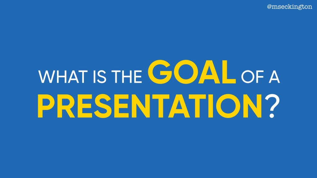
Our third principle is: show AND tell.

Art of Slide Design.060

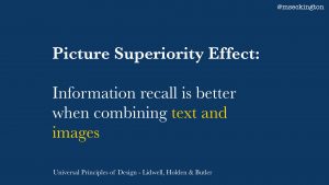
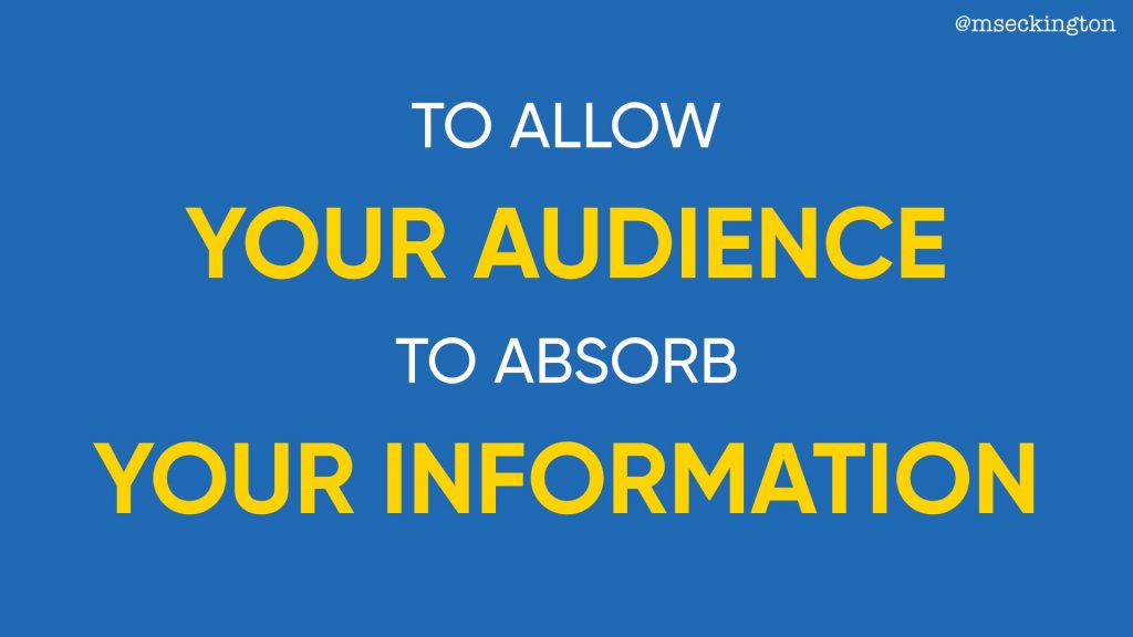
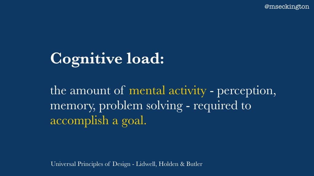
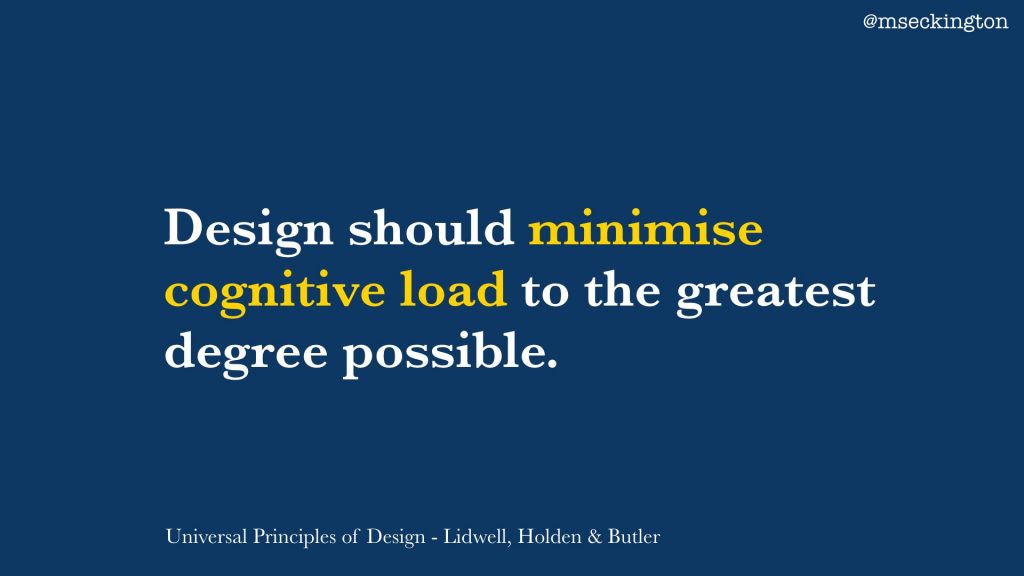
This principle comes from the picture superiority effect, which states that information recall is better when combining text and images.

Art of Slide Design.061

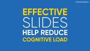
So rather than relying on purely text alone, we should be using visuals to support what we are saying. People remember things better if they’re absorbing that info both in text and in a visual way.

Art of Slide Design.062

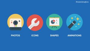
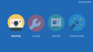
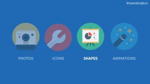
I want to talk about 4 ways of adding visuals to your presentations.

Art of Slide Design.063

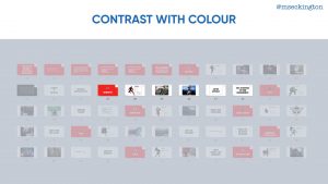
First: photos. Photos are the easiest way of adding visuals to your slides – making them more lively and memorable. The thing with photos and actually also with gifs is that they do need to be relevant to what you are saying.

So keep Principle 1 in mind: maximise signal, minimise noise. The moment that photos aren’t relevant or if the connection is too tenuous, the photo only becomes noise.

Art of Slide Design.064

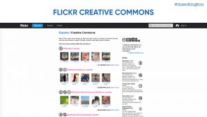
The main place I still go for my photos is Flickr, specifically their creative commons search.

It means that you can easily search for images with specific licences – making it easier to know whether or not you can use them.

Art of Slide Design.065

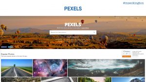
The other place I go is Pexels. They have a huge collection of free to use stock images. While they can be quite pretty, again the main thing to keep in mind here is make sure they’re relevant. If they’re not, it’s better to use an abstract background or just a solid colour. Don’t use photos for the sake of using photos.

Art of Slide Design.066

I mentioned these design bundles earlier already, but again these are great resources for finding images as well.

Art of Slide Design.067

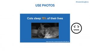
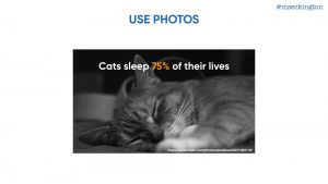
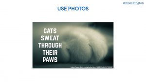
The easiest way to use photos is to use them to completely fill up the slide – and then pair it in some way with text over it.

Art of Slide Design.068

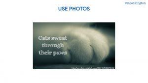
Just to compare: you can see if you use the smaller image, it just doesn’t have as much as an emotional impact.

The image actually makes it more distracting.

Art of Slide Design.069

By using the image as the background, you’re driving the point home much much more. And if you use the right image, the audience will have a much more visceral reaction.

Art of Slide Design.070

Play around and experiment with different photos and different fonts

Art of Slide Design.071

Cause changing either can make a slide feel quite different.

Art of Slide Design.073

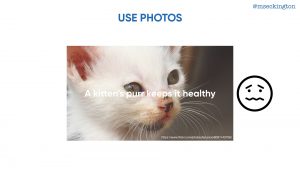
Keep in mind not every photo will work as a background – even though this is an adorable photo of a kitten, you can’t really read the text easily.

Art of Slide Design.074

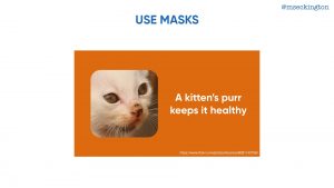
If you really want to use that photo, look at using masks to turn the photo into a specific shape or size.

Art of Slide Design.075

It makes the image just standout slightly more and less like you’ve just plunked the photo into your presentation.
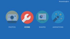
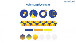
Art of Slide Design.076

Next: icons.

Art of Slide Design.077

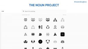
The easiest resource for icons is The Noun Project. This website features a ton of royalty free icons of all different topics, and you’re bound to find icons in there that you can use for your slides.

Art of Slide Design.078

Again I’m mentioning design bundles, just cause that’s where most of my icons from this presentation are from.

Art of Slide Design.079

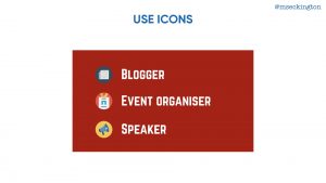
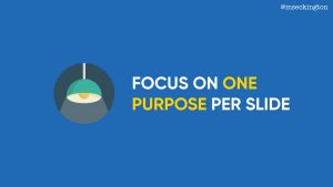
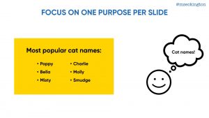
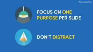
Icons work as nice little highlights to cement the text you’re already showing. It’s a lot less distracting than photos, but it’s enough of a memory cue that it will help people recall information.

Art of Slide Design.080

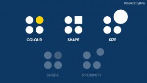
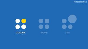
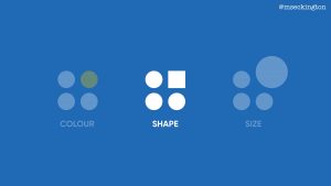
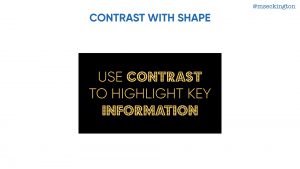
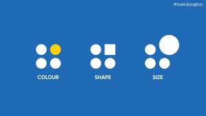
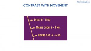
The third way of adding visuals is using shapes.

Art of Slide Design.081

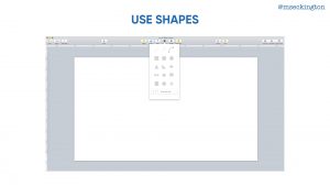
With shapes, I mean use the shapes that are built in your editor – you can make lines, triangles, circles, squares. You can achieve quite a lot when you start combining them to create interesting visuals for your slides.

At this point I should mention that if you use Keynote, it’s worth installing Keynude. Most of the other themes that are built into Keynote have a lot of default settings that are pretty rubbish – stuff like drop shadows around shapes, gradient fills, I always end up losing some time removing those. Keynude pretty much solves this: it’s a simple stripped-back template with grey shapes, flat charts and just a single empty layout slide. If you’re going to be using shapes a lot, Keynude will save you a lot of time.

Art of Slide Design.082

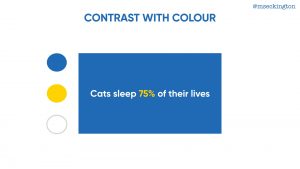
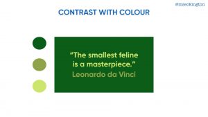
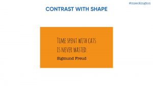
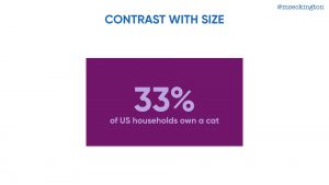
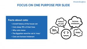
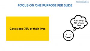
One example is to create simple pie charts or other types of graphs – it makes the stat just jump out a bit more.

Art of Slide Design.083

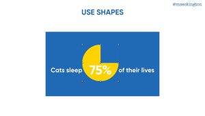
Looking behind the scenes this is built up from 2 elements parts: a circle with a square on top of it, that has the same colour as the background.

Art of Slide Design.084

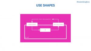
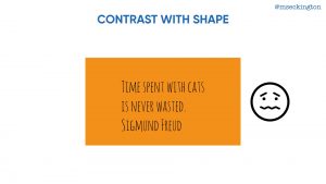
Once you get the hang of shapes you can start constructing more interesting slides – building diagrams that are much clearer than relying on text alone.

Art of Slide Design.085

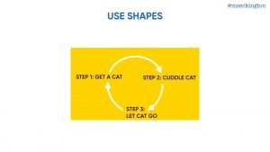
For instance, this is much more visceral and memorable…

Art of Slide Design.086

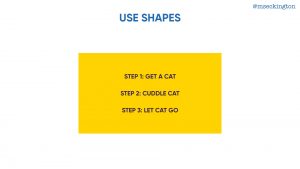
… than just having a plain list.

Art of Slide Design.087

Finally if you combine shapes with fonts and photos, you can really start making your slides look more unique and give them some personality.

Art of Slide Design.088

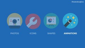
Final way to add visuals: animations.

Before showing some examples, I need to remind you not to misuse them. Most presentation editors support a lot of different animations, and quite frankly most of them are super distracting.

If you use animations, try to make sure the animation you’re using makes sense for the purpose of the slide. If it is distracting, make sure the benefits of using it outweigh the downsides.

I mainly like to use animations if there already is a lot of elements vying for attention on a slide. In this case we already have colour being used, and it isn’t practical to use a different font or a different size to highlight the different elements. So a simple pop animation to grab the attention can work quite well here.

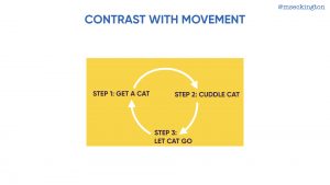
Another way is using animation to reveal elements one by one: it makes it stand out just that bit more, so that people remember it.

Art of Slide Design.090

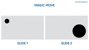
One of the most powerful animations within Keynote is Magic Move.

You basically grab an element – this can be a shape, a font, a photo. Than copy it to the next slide, but changed. So in a different position, or a different size. Keynote will then automatically figure out what your animation should be. You can use Magic Move to very quickly move things around and give some movement to them.

Use animations in places where by using them you’re making it easier for the audience to grasp some idea or concept. For instance in time lines. You’re using the movement to create this illusion of a time line, making it easier for your audience to understand.

Art of Slide Design.095

So those are 4 ways you can add visuals to your slides. Using both text and images means that your audience will be able to grasp your ideas and concepts much quicker and remember them more.

Three down, one to go. Head on over to read about the fourth principle: Be consistent!

I’ll be sharing more tips and tricks on creating slides in the upcoming weeks. Want to hear when the next post goes live? Follow me on Twitter: mseckington or sign up to my newsletter.

Enjoyed this post and want more? You might like: Employee Evangelism: Make Your Team Badass, Blogging tips: How to start writing , How I got into conference speaking and Imposter Syndrome: How we act and work together.

Tags: Geeky

Last weekend I gave a talk at DevRelCon Tokyo called The Art of Slide Design. This is the third post in this series, covering the second principle: make important information stand out. The series is pretty much the blog post version of my script/speaker’s notes for it, albeit split out over several posts!

Go back to read The Art of Slide Design intro and Maximise Signal, Minimise Noise.

Art of Slide Design.030

Our second principle is: make important information stand out.

Art of Slide Design.031

So again let’s go back to some theory (from Universal Principles of Design). The von Restorff effect is a phenomenon where you’re more likely to remember things that are noticeably different than things that are common. This is about making things look more unique or distinctive, so that it stands out more and that people will remember them.

Art of Slide Design.032

This is basically what the definition of contrast is: the state of being strikingly different from something else in juxtaposition or close association. So what we want is to use contrast in our slides to make things memorable.

Art of Slide Design.033

A good example of using contrast comes from this book, Slide:ology, from Nancy Duarte – which is all about how to make good presentations.

Art of Slide Design.034

In it she explains contrast through this visualization, highlighting how we can use contrast in our slides in a couple of different ways – using colour, shape, size, shade and proximity. In each of these examples, you’re automatically drawn to the element that stands out.

Art of Slide Design.035

I’ll only cover three of these here, cause I think shade is a variation of colour and proximity isn’t as easy to apply as the others.

Art of Slide Design.037

I’ll give examples for each of these 3 areas, starting with colour.

Art of Slide Design.038

First step is choose a colour palette with contrasting colours.

In the case of colour, contrasting doesn’t necessarily have to mean exact opposite – it’s more about having colours that work well together and are different enough from each other that you can see that they are noticeably different. I won’t go into too much detail here about colour theory, cause there are plenty of web sites and books out there that cover this.

Art of Slide Design.039

One of those websites I really like though is colorsupplyyy.com. It allows you to quickly try out various colour combinations and shows different variations of it.

Art of Slide Design.040

Plus it also shows you how the colours look together in icons and patterns. So you can get a sense of what type of contrast you might be able to get in your slides.

Art of Slide Design.041

One way of using colour contrast is to use it within a slide to highlight the most important phrase or data.

Going a bit meta, you’ll have noticed that most of my own slides in this presentation have been following exactly this pattern.

Art of Slide Design.042

Another way of using colour is to highlighting different elements on your slide. As I mentioned before the colours don’t need to be too opposite each other – you can use the same colour, in this case: green, and achieve contrast from the different variations of green.

Art of Slide Design.043

Besides using contrast within slides, you can also look at contrast between slides. If you use Keynote, this is the Light Table view – where you can see an overview of all of your slides. I use this overview a lot, cause you can quickly see how all your slides feel as a whole.

This is an overview of one of my presentations from last year about lessons that we could learn from Marvel superheroes.

Art of Slide Design.044

I each time used a red slide at the start of a section to highlight that we were switching to a different superhero.

Because all the other slides are white, the red title slide stands out much more and makes people pay attention.

Art of Slide Design.045

Second way to use contrast is shape. Now traditionally when you think of shapes, you think of shapes like in that example: circles, squares, triangles, etc. And while they can be used within your slides for contrast, those aren’t actually the shapes that we most rely on in our presentations

Art of Slide Design.046

What we rely on a lot are fonts. So one way of achieving contrast is through using different types of fonts within your presentation.

I tend to use custom fonts cause the fonts that are built in to our systems are mostly designed for reading paragraphs of text, so they don’t quite work when on a slide, and also people are more familiar with them already and it won’t stand out as much as it could.

Which fonts you end up choosing is quite a personal choice, and it will depend on your presentation style what type of feeling you want your slides to exhibit.

Art of Slide Design.047

If you don’t want to spend anything, the first place to look for free fonts is Google Fonts.

The main focus of the collection is in providing the fonts as web fonts, but you can download them too and use them in most slide editors.

Art of Slide Design.048

If you’re willing to pay for fonts, I’d suggest taking a look at the bundles on these websites (Design Cuts, Pixel Buddha, DreamBundles, The Hungry JPEG). Rather than buying a single font, you basically buy a bundle of different fonts and they often include quite a large and interesting selection.

Once you have multiple fonts, you can start playing around with them to create contrast. I’ll show a couple of examples, but again this is by no means the only ways you can create contrast.

Art of Slide Design.049

In this first example we are using different fonts within the same phrase or sentence – the contrast is used to highlight specific words.

Art of Slide Design.050

The second way is using different fonts for different elements on the slide.

It’s about making it easy for the audience to understand the different purposes of those elements.

Art of Slide Design.051

Cause if it was all in the same text, it just makes it way too confusing to read and comprehend.

Art of Slide Design.052

The same is true for when you’re displaying code – if you’ve got multiple elements on your slide with different purposes, use contrast to show that they are different.

Art of Slide Design.053

Third way to use contrast: size.

Art of Slide Design.054

The simplest way of using size for contrast is just grabbing a single element and making it bigger – using it to make a statement about something.

Art of Slide Design.055

Or you can play around and make each part of the sentence a different slide. Again you’ll have noticed I tend to use this a lot within my own slides.

Art of Slide Design.056

What becomes interesting though is when you start pairing different fonts with different sizes – it means that you can really play around with making a slide look quite graphic.

Art of Slide Design.057

These type of slides will stand out more and make it more compelling to people. In these cases the contrast is both within the slide and outside of the slide, making the slide more memorable.

Art of Slide Design.058

So those are 3 ways that you can use contrast to highlight key information and make it more memorable for your audience.

Through colour, shape and size.

Two down, two to go. Continue on to read about our third principle: Show AND Tell!

Want to hear when the next post goes live? Follow me on Twitter: mseckington.

Enjoyed this post and want more? You might like: Employee Evangelism: Make Your Team Badass, Blogging tips: How to start writing , How I got into conference speaking and Imposter Syndrome: How we act and work together.

Last weekend I gave a talk at DevRelCon Tokyo called The Art of Slide Design. This is the second post in this series, covering the first principle: maximise signal, minimise noise. The series is pretty much the blog post version of my script/speaker’s notes for it, albeit split out over several posts!

Go back to read The Art of Slide Design intro.

Art of Slide Design.016

Our first principle is maximise signal, minimise noise.

Art of Slide Design.017

This principle comes from the theory of signal to noise ratio (from Universal Principles of Design). This is the concept that in every type of communication we have there is a certain amount of relevant information to us, the signal, and there’s a certain amount of irrelevant information to us, the noise.

With good designs we want to maximise the signal and minimise the noise, ending up with mainly relevant information rather than irrelevant information.

Art of Slide Design.018

So how do we maximise signal and minimise noise in our slide designs? How do we make sure that the information on our slides is mainly relevant rather than irrelevant?

I think there are a few things that we can do to achieve this.

Art of Slide Design.019

The first is focus on one purpose per slide. This is about maximising the signal.

The moment a slide has multiple purposes it dilutes the relevant information you’re trying to get across. Rather than having a single slide covering multiple ideas or concepts, split them out over several slides. This is about making sure that your slide is as relevant as possible to what you are saying at that point of time.

Art of Slide Design.020

One thing I see happen a lot is using bullet points on one slide to cover multiple ideas. For instance take this slide about cat facts. If you’re going to be talking for a few minutes about the history of house cats and then a few minutes about why cats sleep 75% of their lives and then a few minutes about each of the other points, you’re basically diluting the signal of each point you’re trying to make.

Cause while you are talking about the history of cats – your audience is reading and thinking about all the other things that are on your slide already and they won’t be listening to you.

Art of Slide Design.021

It’s much better to spit out those ideas over multiple slides. Allow your audience to focus on the one thing you’re trying to get across, the most relevant information for the audience at that time.

Art of Slide Design.022

Now I’m not saying you shouldn’t be using bullet points at all, but use them to support the specific purpose of your slide. For instance, in this case the bullet points are used to list a set of names that belong together – all the information together is what makes it relevant.

Art of Slide Design.023

Another exception is when you’re using it to recap or give an overview of all the things you’ve said earlier. This slide has the same content as we saw before, but in this scenario, you’ve covered each of points separately already. The purpose is to show stuff you’ve covered before in one single slide – the audience doesn’t have to focus as much on the individual points cause none of it is new information – they’ve each been dealt with separately already.

So context matters a lot.

Art of Slide Design.024

The second thing we want to do is make sure our slides aren’t distracting. In this case we’re trying to minimise noise – ensuring we don’t have any irrelevant information.

Art of Slide Design.025

One way of being distracting is having way too much text on your slide. The moment you have a slide like this, people stop listening to you. Cause they’re either distracted by trying to read all the stuff that’s on there, or they get distracted trying to read and listen at the same time.

Rather than allowing your audience to focus on what you’re saying, by having that much text, you’re basically kicking off all these different questions and thoughts.

Think about what information really matters and distill it down to just the very essential.

Art of Slide Design.026

A variation of this is having too much code on a slide.

Most of the time you really don’t need all of it. Instead focus on the part that actually matters to the audience at that time – don’t force them to try to read all of that, cause you’re only creating a situation for people to zone out and not listen to you.

Art of Slide Design.027

Another way slides can be distracting is when there’s just too much going on in them.

This is an extreme example, but I often feel that people want to use all the space they can on a slide, making things super busy and much harder to process.

Art of Slide Design.028

Keep your slides simple and clean, so that they’re not visually distracting.

This shows exactly the same images as before, but because they’re not overlapping and because there’s no text laid over it, it’s easier for the audience to process.

Art of Slide Design.029

To recap: you can maximise signal by focusing on one purpose per slide and you can minimise noise by reducing distractions on your slide.

Continue on to read about our second principle: Make Important Information Stand Out!

Want to hear when the next post goes live? Follow me on Twitter: mseckington.

Enjoyed this post and want more? You might like: Employee Evangelism: Make Your Team Badass, Blogging tips: How to start writing , How I got into conference speaking and Imposter Syndrome: How we act and work together.

The Art of Slide Design

August 4th, 2017

Last weekend I gave a talk at DevRelCon Tokyo called The Art of Slide Design. This is pretty much the blog post version of my script/speaker’s notes for it, albeit split out over several posts!

I’ll be publishing the posts over the next couple of days, starting today with the intro (this post) and the first principle Maximise Signal, Minimise Noise.

I’m also planning on doing some followup posts to go into more detail about some of the topics (like choosing custom fonts and creating animations). For now though, this is staying pretty true to the original talk. Check out the full slides on SpeakerDeck.

Art of Slide Design.001

As I’ve mentioned before on this blog, for most of my life I hated giving presentations – as a kid, as a teen, as a university student. I was so scared and nervous in front of people that I tried to avoid giving them as much as I could. Whenever I did have to do one, I’d be a bunch of nerves for the entire week before, and often because of my nerves the presentation wouldn’t turn out that great. I didn’t believe it was something I’d ever be able to do well and I really didn’t believe it was something I’d ever enjoy.

Nowadays I actually like giving presentations. For the past 3 years, I’ve been giving talks at meetups and conferences, and part of my role at FutureLearn is to encourage my team to both blog and speak more (read more about that in my post about employee evangelism).

Art of Slide Design.004

For me, the secret, the magical solution, came from preparation.

I find that whenever I try to learn something new, it becomes easier for me if I understand all the different aspects, all the different building blocks of what it is that I’m to learn. With presentations it was about understanding my emotions and how my face and body and voice were reacting when I got nervous. It was about understanding how to tell compelling stories and how to keep the audience engaged. It was about discovering how often I need to practice until I feel completely comfortable with what I’m going to say. And it’s about understanding how to use the tools I have in the most effective way.

Art of Slide Design.005

Alongside our voice and our words, our slides are the most important instrument in our presenter’s toolbox. And we should learn to use them as effectively as we can.

Nowadays after most of my talks, I’ll often get compliments that people really liked my slides, sometimes with the sly additional question whether I got someone else to create them (nope, just me). Just like mastering other skills, once you know some of the tricks, it does get easier the more you do it.

So that’s what this series of blog posts are about: how to create effective slides.

But what does that mean? What makes your slides effective?

Art of Slide Design.006

Let’s take a step back and look at why we are presenting in the first place: what’s the goal of a presentation? At first glance you might think each presentation is different: some will be about teaching a new skill or knowledge, some will be to convince people to use a specific product, some will be to inspire and motivate people to change or do something.

There are endless goals of what a presentation is for and no two presentations will be the same.

Art of Slide Design.007

Yet at the heart of it, they all have one thing in common: no matter what your motivation behind the presentation is, your #1 goal as a presenter is to allow your audience to absorb your information. Whether you’re trying to teach, convince, motivate, frighten, sell, inspire – it’s your responsibility to make that easier for your audience.

Art of Slide Design.008

This all ties in with the concept of cognitive load: the amount of mental activity – perception, memory, problem solving – required to accomplish a goal.

Art of Slide Design.009

This definition comes from the book: Universal Principles of Design and I’ll be referring to it a couple of times throughout these blog posts. It’s a great resource book covering 125 design principles and ties it back to psychology and physiology research.

Art of Slide Design.010

In that book we also find this quote about cognitive load: design should minimise cognitive load to the greatest degree possible.

Art of Slide Design.011

So when we talk about effective slides, we mean slides that help reduce that cognitive load.

Art of Slide Design.012

Slides that help rather than prevent people from consuming your information.

Art of Slide Design.013

So how do you create effective slides? How do you create slides that are compelling and help your audience?

Art of Slide Design.014

The answer lies in shifting that question to: how do you design effective slides? We can get a better understanding of slide design, by looking at design theory.

Art of Slide Design.015

In the next few posts, I want to share 4 principles of slide design, so that you can create more compelling slides and help your audience absorb the information you’re presenting.

One thing to bear in mind here is that I don’t believe there is “one true way” of creating slides. This isn’t about getting you all to create the same type of slides that I do – rather it’s helping you get a basic understanding of design theory and applying it to your own style.

If you’re starting out, don’t feel like you have to attempt changing all of your slides in one go: choose one principle to apply to your next presentation and build from there. Hopefully you’ll be able to hit the ground running with some of the tips in these post and make your slides a little bit more unique and effective.

Let’s start with the first principle: Maximise Signal, Minimise Noise.

Enjoyed this post and want more? Follow me on Twitter: mseckington. You might also like: Employee Evangelism: Make Your Team Badass, Blogging tips: How to start writing , How I got into conference speaking and Imposter Syndrome: How we act and work together.

One of other the reasons why I’ve not found the time to blog here more: I’ve been doing more talks! I have to admit it is a lot of hard work, but getting to travel, see new places and meet new people is definitely worth it for me.

Last month I got invited to speak at Codemania in Auckland and at YOW! West in Perth, and I had an awesome time at both conferences. I also managed to combine those talks with a 3 week trip traveling and sightseeing through New Zealand and Australia – this was the first time since I was 8 that I was back in Australia!

The talk I gave there was about how you should reflect and refactor your own skills, values and behaviours, to help you understand what you want to be and what you want to do with your life. Here’s the video of my (closing!) keynote at YOW!:

I’d love to hear stories from people who have tried some of the reflection and refactoring techniques I’ve talked about. Let me know what worked for you!

Nobody expects the lady code troll:

As you might have noticed, this is my 5th post this week! I’ve been trying to figure out how to get back to writing more regularly and sharing more of the ‘stuff’ I’ve been consuming in my spare time. The general idea is to do at least one quick and easy post per day about something I’m interested in. So far it’s motivating me to write more, but I’d love to hear what people are most interested in hearing about!

In light of that, I’m reviving another ‘old’ post series of mine ‘Listening To‘: I started it with the intention to share what music I’m enjoying, but am expanding that to include podcasts, audio books and concerts!

imaginary_worlds

For today’s post I wanted to highlight a podcast I started listening to recently: Imaginary Worlds. It describes itself as:

“Imaginary Worlds is a bi-weekly podcast about science fiction and other fantasy genres — how we create them and why we suspend our disbelief. These are the backstories to our stories.”

It’s my new favourite podcast and in the past 2 weeks I’ve listened to the majority of their archive (it goes back about 2 years)! Imaginary Worlds gives us a glimpse behind the curtain of some of my favourite geeky books and shows: Star Wars, Harry Potter, Game of Thrones, there are a ton of different geeky topics that get covered, often with perspectives that I hadn’t considered before. Pretty much anyone that enjoys geeky stories should try out this podcast!

Current favourites episodes: Fantasy Maps about the work and detail that goes into creating them, 1977, a look into the state of the world and pop culture when Star Wars came out, and Beware of Cyber City about a three-dimensional model of a town that the military uses for cyber war games.