The Art of Slide Design: Be Consistent
A few months back I gave a talk at DevRelCon Tokyo called The Art of Slide Design. This is the fifth post in this series, covering the final principle: be consistent. The series is pretty much the blog post version of my script/speaker’s notes for it, albeit split out over several posts!
Go back to read The Art of Slide Design intro, Maximise Signal, Minimise Noise, Make Important Information Stand Out and Show AND Tell.
The final principle is Be Consistent. When we hear consistent, I think some people interpret that as let’s make everything look the same. “I’ll use the same background and the same font for every single slide.” That’s not what I mean here.
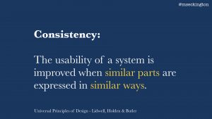
In design, consistency is defined like this: the usability of a system is improved when similar parts are expressed in similar ways. So when we’re talking about consistency in slide design, it’s about making sure that those slides that are similar look and feel the same way. I think slides are similar if they have a similar purpose.

Bit of a mouthful, but: use consistent designs for slides with the same purpose

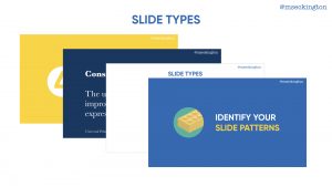
So this is all about identifying your slide patterns: what are the types of slides within your presentation that you keep using over and over again? Once you know what types of slides you have, you can make sure they follow the same patterns.
I’ll use the images in these blog posts as an example, cause by now you’ve been exposed to some of these patterns.
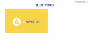
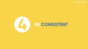
To start this presentation had the heading slides: bright and yellow to stand out.
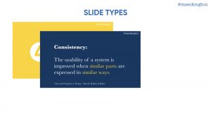
We then had our design theory slides: dark blue background with a serif font in white and highlight words in yellow.
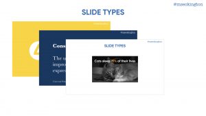
The example sides: a white background with a centred image and a light blue heading.
And then all the other slides: which followed the basic design of white and yellow text on a light blue background.
With some variations.
Having these building blocks means that your audience has reference points. They become easier to process, even though it might happen subconsciously.
The handy thing of breaking it down like this means that for future presentations you have much more tangible building blocks to use. And as you do more and more presentations you end up building up your own library of patterns that you can reuse, and it becomes easier and quicker to put slides together.

So identify your slide patterns: what are the types of slides that are in your presentations?
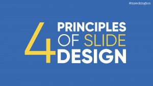
Those are 4 principles of slide design.
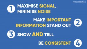
To recap: Maximise Signal, Minimise Noise, Make Important Information Stand Out, Show AND Tell and Be Consistent.
I hope that by applying these you’ll make it easier for your audience to consume the information that you’re presenting and create more effective and beautiful presentations.

If you had told me 10 years ago that nowadays I would regularly be giving presentations and enjoying it, I wouldn’t have believed you.
At the time I assumed that to give a good presentation I would need to focus a lot on me. Making sure that what I say is good and correct. Making sure that I don’t make a fool of myself. Making sure that I don’t eh and uhm.
In reality though, the “me” part of it isn’t that important.
Good presentations are all about the audience – it’s your job as a presenter to make sure that you teach, inspire and motivate your audience.
I’ll be sharing more tips and tricks on creating slides and public speaking in the upcoming weeks. Want to hear when the next post goes live? Follow me on Twitter: @mseckington or sign up to my newsletter.
Enjoyed this post and want more? You might like: Employee Evangelism: Make Your Team Badass, Blogging tips: How to start writing , How I got into conference speaking and Imposter Syndrome: How we act and work together.