Iron Man 2 – Behind The Interfaces
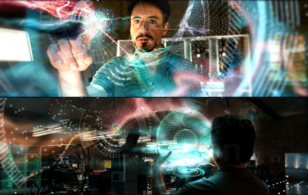
By now I think most of you have seen Iron Man 2 and I’m guessing you all noticed the amazing gadgets that Tony Stark uses. The transparent phone at his hearing, his holographic workshop where he ‘creates’ a new element, the ‘smart-glass’ coffee table… those were some cool looking interfaces.

It turns out that one company, Perception, was behind designing all of these. They’ve got a case study about designing for Iron Man 2 up on their website and it’s an interesting read. They first got involved with the design of the graphics during the Stark Expo presentation; so all the logos and animations that you saw behind Tony during the presentation. After that though they pitched their concept of the transparent phone and they got brought on board to develop more concept interfaces.
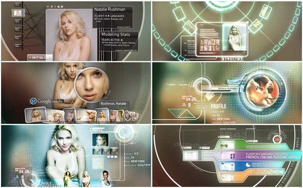
My favourite has got to be the ‘smart glass’ coffee table that Stark uses to do a background check on Natalie Rushman. Perception presented a couple of futuristic designs of a simple Google search:

At the end Perception worked on tying everything together, fusing their designs into the existing footage:
If you want to read more about what Perception did for Iron Man 2, head on over to their website for their case study. As I said above, it’s a great read and they were involved in designing a lot of the stuff that made the world of Iron Man 2 look futuristic and amazing.
